
Online marketers underestimate the powerful role that colour plays in enticing users. Copywriters, graphic designers, and web developers all need to understand the psychology of colour in order to construct efficient websites and landing pages.
The colour of your website background
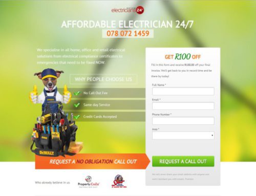
Ask yourself what feeling you are trying to generate for your audience when they visit your website. The background of every page will obviously be the most overpowering element which invokes emotion for your users.
SOME ADVICE:
- Are you trying to give off a balanced feel?
WHITE or LIGHT GRAY may be your best option.
- Are you trying to invoke excitement about your product or service?
Rather opt for a nice ORANGE background to reach this goal.
The colour of your fonts
Of course the fonts you use should contrast nicely with your background, but not at the expense of the emotions you’re trying to generate.
Make sure your font colour matches the secondary emotion you are trying to emphasize.
REMEMBER:
Kill two birds with one stone! YELLOW speaks of safety while BLUE invokes trust. These two elements can work well together and—at the same time—are brilliant contrasts.
The colour of your call to action
Here’s an important one. Tests done via our landing pages have proven a huge rise in lead generation by simply changing the call to action box colour!
IMPORTANT:
Depending on your industry, keep a colour=emotion chart nearby so that you can utilize the power of colour to your advantage when adding a call to action button on your page.
The colour of your logo
Your loge will appear on your website, on Facebook, on your products, your vehicles…EVERYWHERE! It simply MUST represent your company properly.
DON’T FORGET:
If you want to come across as creative and fun, then colours such as PURPLE and PINK should dominate your logo.
If you are going for more of a bold demeanour, then let RED play the main role in your logo design.


Leave A Comment
You must be logged in to post a comment.